Today marks the 100th anniversary of the birth of Otl Aicher (1922-1991), an important and influential graphic designer, who is perhaps best known for his designs for the 1972 Munich Olympics. He is also remembered for his pioneering corporate identity commissions, simple and elegant designs for some major German companies, and for his work on typography.
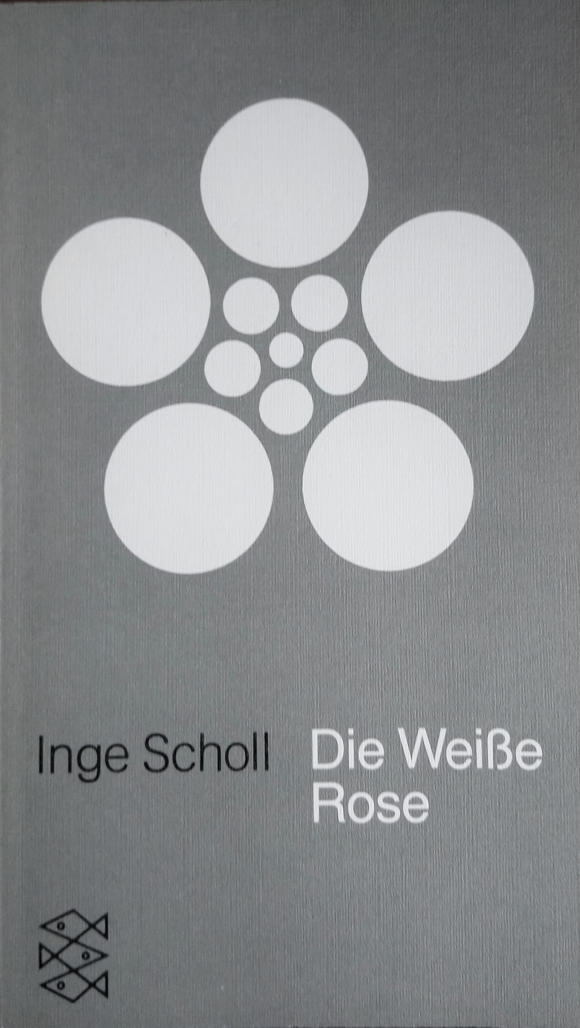
Aicher spent his teenage years in Nazi Germany and showed his objection to the regime by refusing to join the Hitler Youth. Through his friendship with their brother, he had links with Hans and Sophie Scholl. The Scholls were key members of the White Rose resistance movement and were executed in 1943. Later, in 1952, he married Inge Scholl, their older sister. In the same year she published the book Die Weisse Rose which told the story of her siblings’ actions.
Aicher’s teenage and wartime experiences undoubtedly shaped him and drove him to an awareness of the need for social responsibility and the belief that it was the duty of designers to make a contribution to the improvement of society. He was also influenced by philosophers such as William of Ockham, Kant and Wittgenstein.
In 1953, Aicher was a co-founder, along with his wife and the Swiss designer and architect Max Bill, of the Hochschule für Gestaltung Ulm (HfG). This experimental and progressive design college in the tradition of Bauhaus was only open for fifteen years but was influential in postwar design education. More details on the HfG can be found in these books:
- HFG Ulm: the view behind the foreground : the political history of the Ulm School of Design, 1953-1968 (C200.b.3479)
- Die Hochschule für Gestaltung Ulm: Anfänge eines Projektes der unnachgiebigen Moderne = The Ulm School of Design: beginnings of a project of unyielding modernity (C200.a.2930)
- Vom Bauhaus beflügelt: Menschen und Ideen an der Hochschule für Gestaltung Ulm (C214.c.6995)

In the 1950s the consumer products company Braun led the way in creating a uniform corporate identity, in partnership with the Ulm School of Design. Aicher and his students designed a new modular exhibition stand along with shop window displays. Aicher was subsequently instrumental in a rebranding programme for Lufthansa in the early 1960s, retaining the image of a flying bird but enclosing it in a circle and changing the lettering to the Helvetica font. This design, albeit with a recent minor tweak, has survived until now. He also worked on logos for several banks including in 1972 the one for the Sparkasse network, reworking Lois Gaigg’s 1930s design in black into the clear and simple red logo still in use today and a common sight across Germany.
In the late 1960s Aicher was tasked with leading the design team for the whole look of the 1972 Olympic Games in Munich, presenting a new, modern Germany to the world. His chosen colour palette, steering well clear of the nationalistic red and black of the 1936 Berlin games, was dominated by light blue and white, inspired by the view of the Alps from Munich. Green, orange and yellow were also mixed in, and the Univers typeface was used.
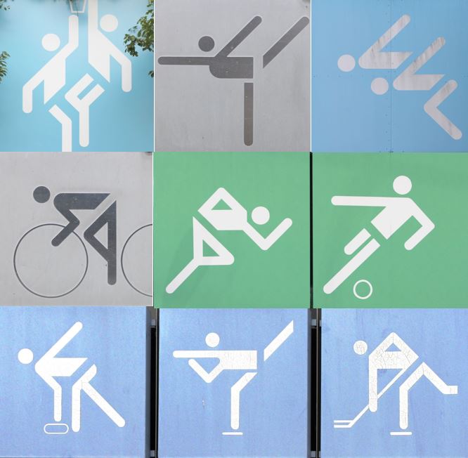
Perhaps Aicher’s most lasting legacy from the Olympics is his development of pictograms. Clearly, these were not his invention – predecessors include Stone Age cave paintings, ancient Egyptian hieroglyphs, Otto Neurath’s 1920s Isotype and a system of pictograms first used at the 1964 Tokyo Olympics. He did however, expand and progress this system into a large set of visual signs and symbols that were universally comprehensible to a multilingual audience and which represented different sports and activities, to help people find their way around the Olympic village. A uniformity of design was achieved by creating them on square grids with elements of the figures at either 45° or 90°.
Aicher was also commissioned at around the same time to work on a signage system for Frankfurt airport in conjunction with ERCO lighting; his standardised pictorial language and the influence of it is much in evidence today in airports and other public buildings. More examples can be viewed here.
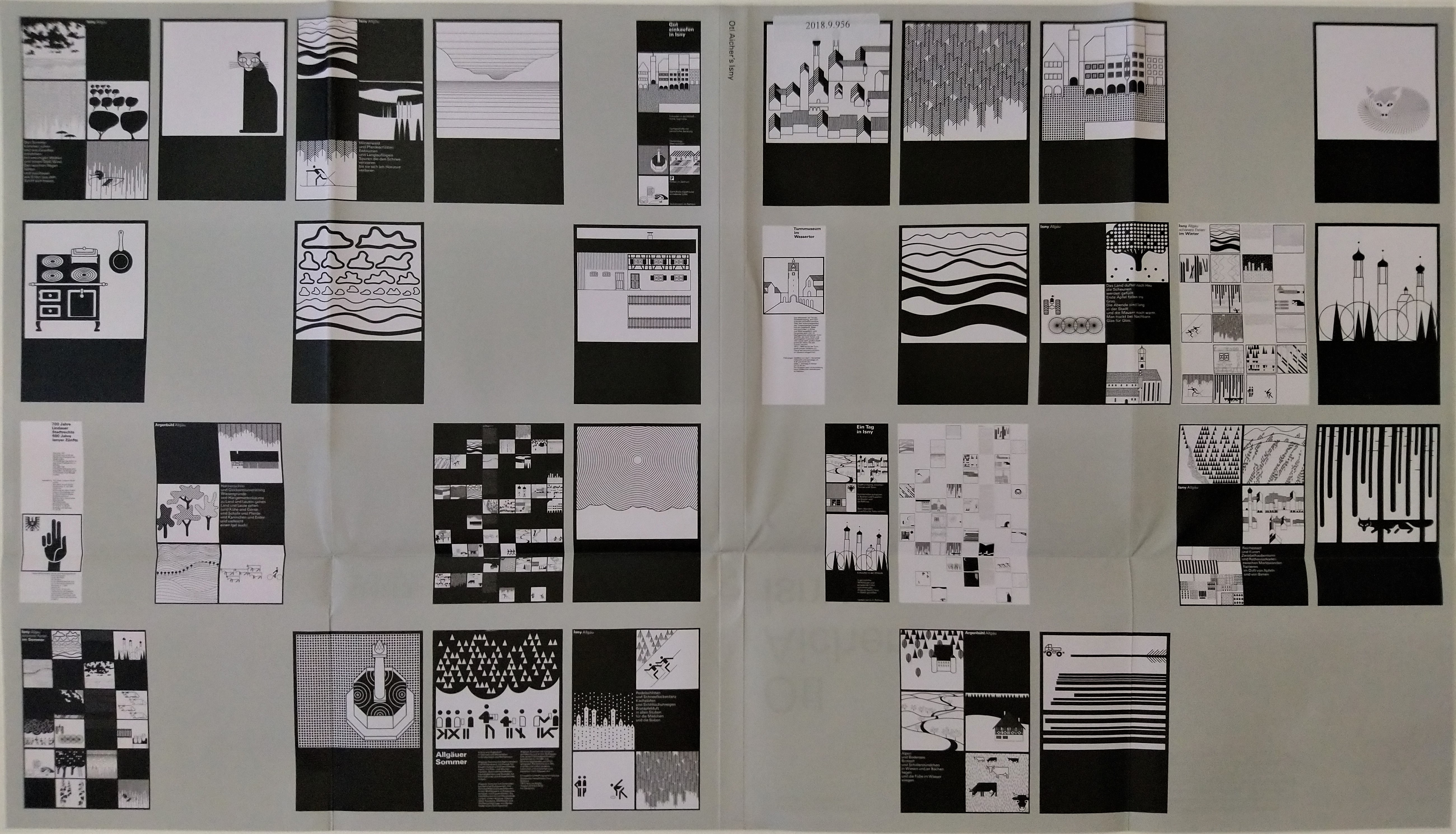
In the early 1970s Aicher relocated both his family life and his work to the grounds of an old mill in the Allgäu region of southern Germany, creating a kind of design commune in the studio buildings. This place, Rotis, was his base for the rest of his life and an idyllic place to welcome colleagues and friends, including the architect Norman Foster (they worked together on the metro system in Bilbao) who wrote the preface to Otl Aicher’s Isny: how a German town defied the postcard mentality (2018.9.956). This book deals with Aicher’s work on rebranding a nearby town which involved creating more than 100 sparse black and white square images, very different from the approach that most small towns were taking to represent themselves in the 1970s.
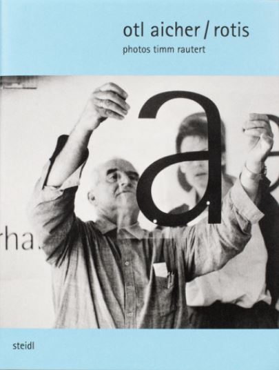
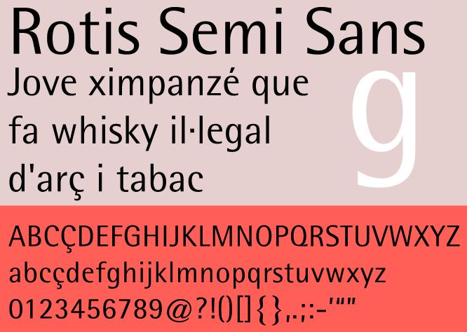
Aicher’s contribution to typography includes in the late 1980s the development of a new typeface, Rotis, named after his residence. This was similar to Univers but a little thinner and was intended to be read more easily and quickly than existing fonts. He also wrote a lengthy analysis of the history and functions of typography, Typographie (860.a.34), published in his own font and with no capital letters in the German text, neither at the beginnings of sentences nor used for nouns/names – Aicher had a strong sense that lower case lettering was important to express social equality and to show a rejection of absolutist state power. Our most recent acquisition on Aicher, Otl Aicher / Rotis (C218.c.2052) celebrates the typographical aspect of his work.
A few months before he would turn 70, Otl Aicher died in an accident (hit by a car while mowing the grass). Some of his writings encompassing his thoughts on culture, design and politics have been published posthumously, including in English translation (an initiative of Norman Foster after Aicher’s untimely death):
- Analog und digital (2015.8.1634)/ Analogous and digital (2015.8.2484)
- The world as design (C209.c.6355)
- Schreiben und widersprechen (571:76.c.95.468): includes a piece by the East German author Christa Wolf about a brief stay at Rotis in May 1988 and the Aichers’ reciprocal visit to her and her husband in Mecklenburg in 1989 (they had met and become friends in 1987 when Wolf was awarded the Geschwister-Scholl prize in Munich for Störfall in which she responded to the Chernobyl nuclear disaster.
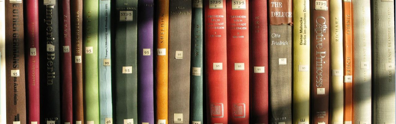
Other people’s memories of him are included in Freundschaft und Begegnung: Erinnerungen an Otl Aicher (9002.b.650). We also have a detailed biography of him, Otl Aicher, Gestalter by Eva Moser (C212.c.9413). Perhaps the definitive book on Aicher is by Markus Rathgeb (2006 edition: C200.a.2143; 2015 edition: 2015.13.160) who earlier wrote his doctoral thesis on Aicher at Reading University. The cover of the 2015 edition opens out to show many examples of Aicher’s work (click on the images to see larger versions).


Katharine Dicks
